UX writing case study
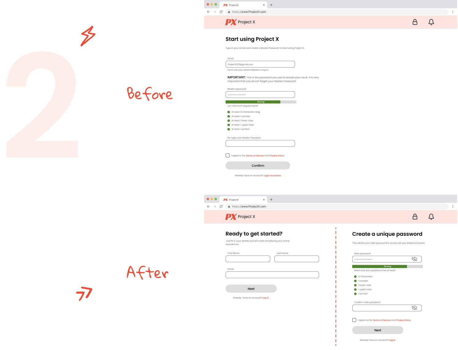
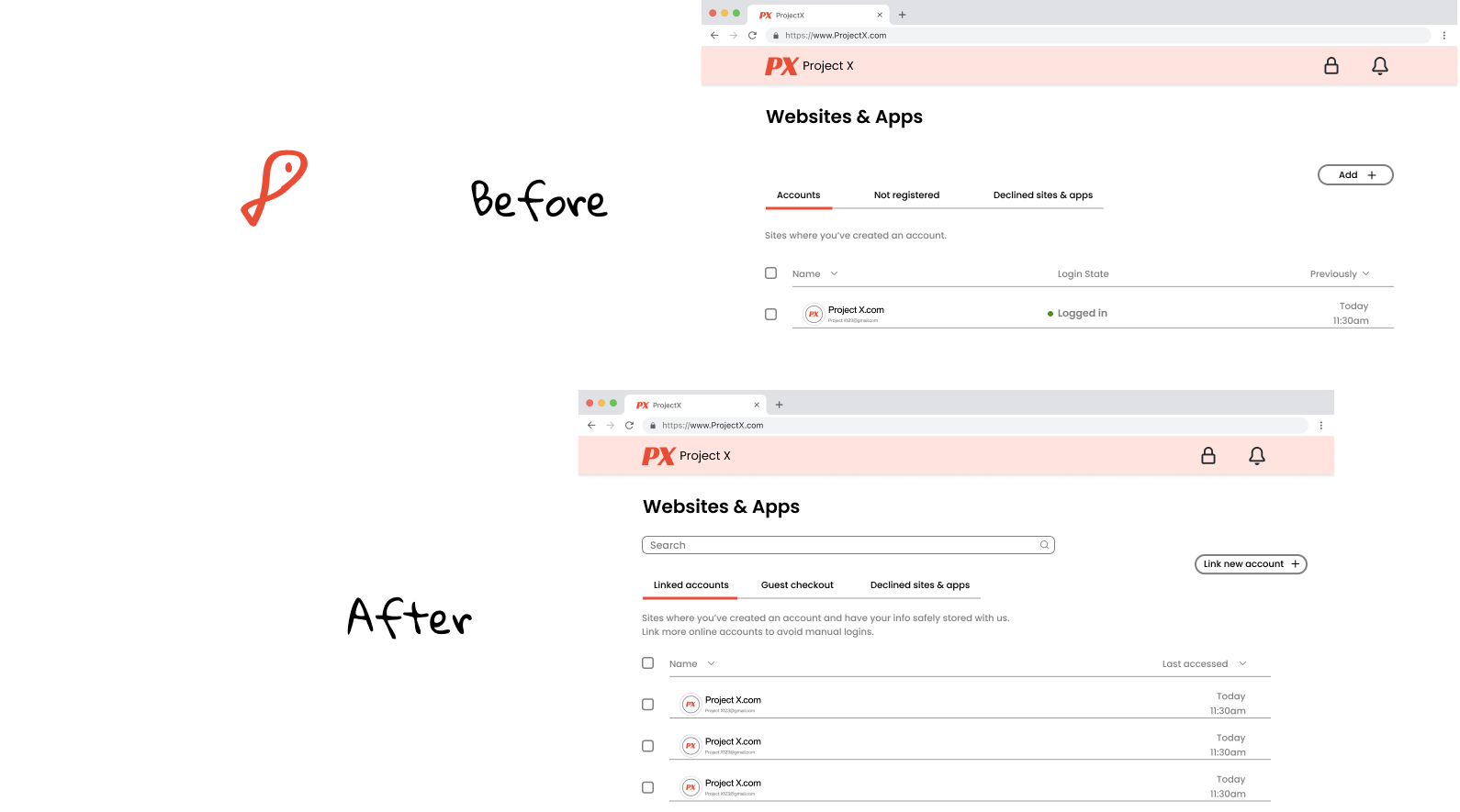
About Project X

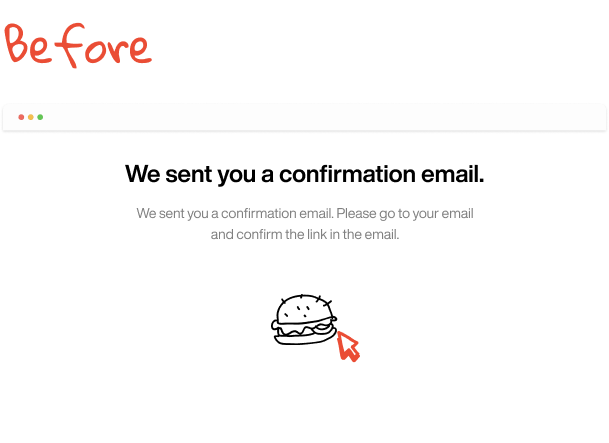
This is a browser extension that manages passwords and lets users automatically fill in their credentials across sites.
Our goal was to create a clear and friendly sign up flow. Then we wanted users to easily understand where to link online accounts with us.

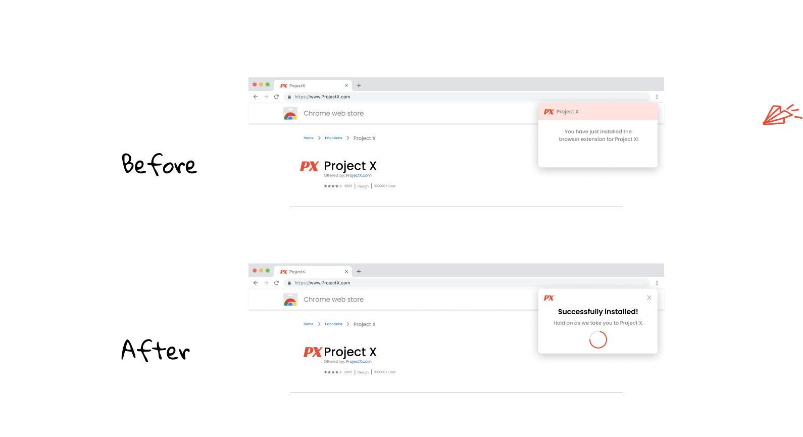
  • Easily scannable with a headline.
  • Product name isn’t critical to highlight in header since we’re on the installaton page.
  • Added a loading bar to show visual progress.
  • Swapped the order of the flow to get
    their name and email first, then the password.
  • I removed the text repetition, made it more
    conversational and less visually cluttered.
  • Got rid of the repetition.
  • Included positive feedback for the user so they know they’re almost done with the process.
  • Swapped for a more relevant image and added a way to resend the email in case they didn't receive it.
  • “Accounts” can be confusing so I had to make it clear it’s what they already shared with us.
  • Eliminated the “Login state” as it wasn’t useful.
  • Changed the button text so users can easily link new accounts and avoid confusion.

The results

We (UX designer, UX researcher, and I) prepared instructions and a detailed questionaire
for 6 user participants. We conducted a usability study to compare and go through a more
detailed flow of the two versions above (before and after).

Each session lasted 60 minutes and we witnessed how users interacted with the extension in real-time.
As a result, 98% of users preferred the latest version (after) according to a set of metrics and had
no problems understanding how to link their first online account with us.