UX Writing

Writing for different startups, lone CEOs, and global corporations helped me to craft copy that’s consistent, helpful, and concise while collaborating with everyone needed to put forth an exceptional product experience.


  • Senior UX writer and team lead at Avast Software
  • First UX writer at ESET, establishing a writing/design process and laying the style guide foundations
  • Design tools: Figma, Adobe XD, Miro, Invision, Sketch
  • Speaker at the UX Writing Conference 2021
Nope, no marketing texts here
Copywriting isn’t UX writing. Here I lay off of
the sales and marketing tactics and focus purely
on helping people easily navigate your app or
site to accomplish what they came to do.
The most common challenges I notice:
  • Inconsistency in word choices
  • Too niche wording, jargon
  • Conficting design and copy
  • Confusing or unhelpful instructions
  • Copywriting
Designers are my allies   

Design and copy go hand in hand. Excellent UX writing thrives off well-thought designs and vice versa. I continuously evaluate the entire user experience while offering strategic solutions to improve it.

What my UX writing looks like:
  • Nailing your onboarding flows to show people how your app works,
    resulting in higher retention rates.

  • Creating useful error messages that don’t just say “Oops, something went wrong” or “A
    technical error occured” without offering an explanation and solution.

  • Writing clear tooltip explanations to give people a more in-depth explanation
    of what a new term means or what a feature really does – without repetition.

  • Having consistent and accurate wording so that we don’t have OK, OKAY, Ok, and ok across the app, lowering your level of professionalism and trustworthiness.

  • Providing helpful instructions to give everyone the full picture of what to do and expect so there are no unwanted surprises – especially when it comes to sensitive information.

My process
Asking a heck ton of questions.

I’ll need to know the ins and outs of your tech and your product. I’ll align with your designers, developers, brand team, researchers and project managers to have the context I need to eliminate gaps for your users.

What tools are we using?

Figma, Invision, Sketch, you name it – the main thing is that we collaborate within the designs themselves to see what the text looks like in its real environment.

What is the goal of this flow?

The main goal has to be clearly stated and understood. How many steps will it take? Could we eliminate or even combine some to make the experience smoother?

Can we test this?

What resources do you have to test? Whether it’s A/B testing, usability interviews, or even Google Trends, let’s back our words with as much data as we can.

UX writing case study

About Project X

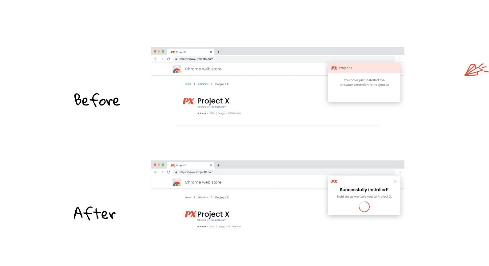
This is a browser extension that manages passwords and lets users automatically fill in their credentials across sites.
Our goal was to create a clear and friendly sign up flow. Then we wanted users to easily understand where to link online accounts with us.

  • Easily scannable with a headline.
  • Product name isn’t critical to highlight in header since we’re on the installaton page.
  • Added a loading bar to show visual progress.
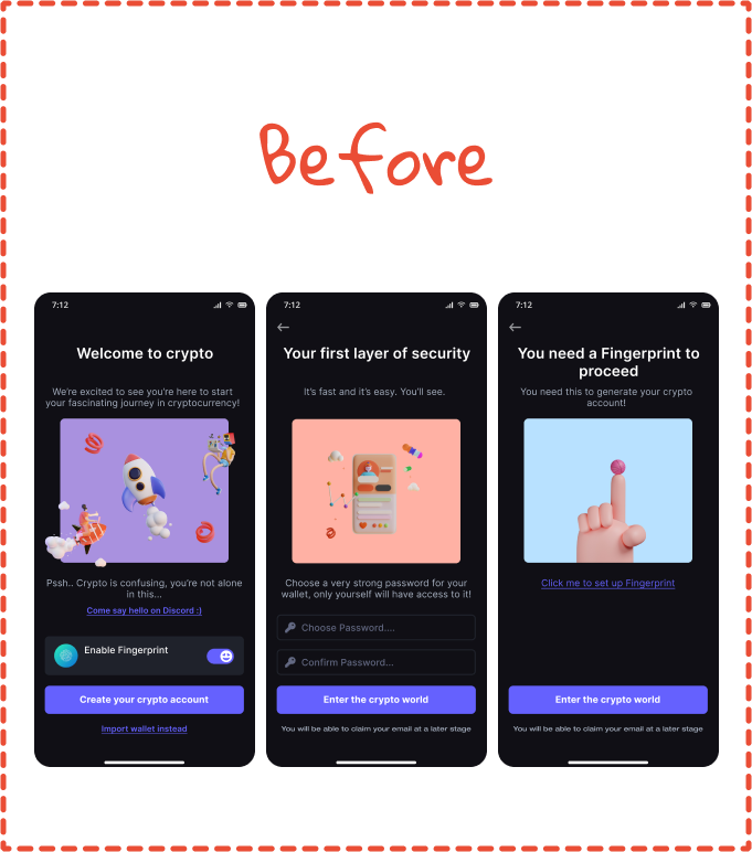
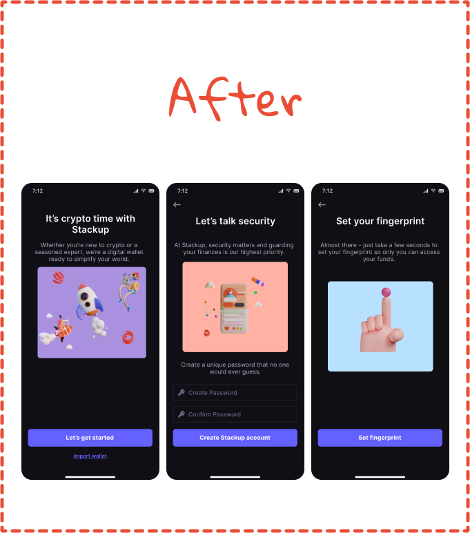
  • An onboarding flow where I had to keep in mind that
    most users were new to the crypto scene.
  • Altered the text to be more friendly, inviting, less technical,
    more understandable so users don’t get intimidated.
  • Eliminated a lot of the visual clutter, convinced stakeholders that
    we could display other options at a later stage - right now the focus should just be on
    onboarding them smoothly with clear set up instructions.
Hear what our users mentioned